Friday, 20 March 2015

Research and Planning:Creative Brief for Advert.

Creative Brief For Advert
Release Date: 17th January 2015    Album Title: Belong to the City. 

Project Managers: Darhyl Matias, Chloe Boylan, Sean Mutiso
Product Overview:

Who are they?
Sean De La Rose is originally from North London, and is releasing his debut album, therefore he needs an advert to go along with it to be part of the promotional campaign . The music video for ‘Follow’ will be released on the 17th January 2015 at the same time as his album will be released “Belong to the City”.

What is the concept?
We need to have the advert taking a similar look to the digipak and music video where it will be looking very simple, yet eye catching with a simple ideas that promote key features of the album, such as release date and where to download. This is so that the audience will know how they can purchase the product as Sean De La Rose will need as many new fans as possible with it being a debut. He is a modern artist who plays tribute to old styles of music like Jazz and Swing, but is influenced by modern day artists like Justin Timberlake and Chris Brown. We want this idea to be reflected in the advert but trying to show his style and morals all through the image and location chosen for the advert. 

Why are we doing it? 
This has to be a memorable and eye catching advert simply because we want to get as many people to notice Sean in spaces of advertising like bus stops and billboards on roads in order to create a new and long lasting fan base that will remember him and want to buy his album. He will wear smart, but fashionable clothing in the advert too in order to try and create a relationship with the audience before even actually listening to the music.

Comparable Products?
Artists such as Justin Timberlake, Chris Brown and Frank Sinatra are all artists that we would like to follow in the footsteps of. In terms of similar adverts, we want him to also have the style and persona of the likes of Michael Buble too as he is a relatively young modern artist who has a. old feel to his work. Sean will attract all their fans by allowing the audience to have a strong relationship with him due to his clothing and simple advert design that people will remember.

The advert:
Consumer:
Primary: 
Male: 45% Aged 12 - 45
Secondary:
Female: 65% Aged 12 - 45

What is the reaction we want?
We want is a positive reaction to the advert due to our target audience mainly being teenagers and young adults as our consumers need to be able to relate to our brand and artist. With this positive reaction from the mainstream and diverse audience, they will create a relationship between the artist and the consumer. AS for doing this it allows for the people to share similar view and beliefs with each others.

How Will We Know It Worked?
It would have worked by the product gaining a positive reaction from the consumers when released and know about our album campaign which will be assisted by our advert. We will create many drafts and there will be a focus group being created so that we can gain some audience feedback from the fans he already has, with doing this it allows us to improve what we did wrong at first. We will also look at comparable products and artist to ensure we are reflecting the appropriate conventions. 

Key launch Dates: 
Press Campaign:  11th December 2014
Album Release: 27th January 2015

Advert information: 

Album name: Belong to the city
Key singles: ‘Follow’, ‘Tuesday Night’ and ‘Night Karma’.
Album release date: 27th January 2015
Available to download: Spotify, Itunes and Amazon.

Research and Planning: Digipak Conventions.

I analysed the Robbie Williams digipak because it fits the jazz genre.

Digipak analysis of conventions – Robbie Williams: Swing when you’re winning


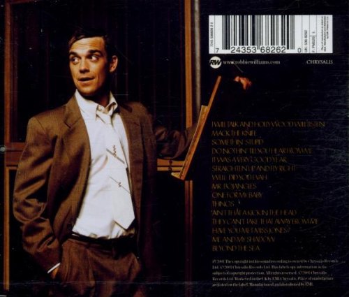
Main image: The main images are of the male artist, Robbie Williams. This is conventional to the Jazz/Swing genre and the Pop genre he originates from as he is a young, attractive singer, therefore the main focus of attraction to appeal to his fanbase. Conventionally, he is presented with a Medium Close-up which allows the audience to see him clearly. Although he is looking away from the camera, enough of his face can be seen to appeal to audiences.  
Star motifs – refer to Dyer’s theory: 
Williams’s ‘Star Image’ is apparent within this digipak as he is conventionally represented to the Jazz style which he is not associated with much, therefore his ‘look’ is visually appealing. Further, the use of the medium close-up allows his face to be sold to the audience clearly. He looks smart and professional, but cheeky and relaxed at the same which reflects the genre as well as Williams himself. It is clear that a ‘star image’ is being created and his personality being sold to the audience.  
Lighting and colours: The digi-pak is heavily reliant on themed colours, using mainly shades of brown and white – this is reflected in the font, scenery depicted and even the clothing of the artist. These colours suggest a rustic, smart casual setting – similar to the image reflected by Williams himself.
Sub images: The only sub images used in the digi-pak are props relating to the artist, showing him in a particular setting (music studio). They are used to show him in a natural environment and to enhance his character, giving context and a sense of habitual behaviour within the images, allowing the audience to engage with William’s personality as a selling point.
Typography/font: The text is bold and easy read, with the artist’s name as the main focus. The font of the artist’s name is a different colour, bringing it more in line with the colour scheme in the images. 
Layout: The artist remains the main selling point of the digi-pak, on both the back and front his image occupies half of the page. The text is very readable and bold making the digi-pak very approachable and welcoming to a consumer.
Information: key information is visible on the digipak which is conventional to the product, and required for legal purposes. For example, album name and artist name is apparent which is needed to sell the digipak, as well as the legal information such as a barcode and institution details. 
Album name and track-list: Both are laid out very clearly for the consumer to reference. The font colours correlate with the imagery. 

What I would take from this:
-Main image of the star as the focus
-Star to wear a suit
-Colours such as black white and brown to be used
-Classic typography.

Planning: Artist Image.

Artist image:
Link to theory:
Goodwin: will use extreme close-up, close-ups and medium close up on artist to enhance his star image.
Mulvey: Artist is male so do not need to consider this. 
Popular culture: artist will portray popular culture by engaging in activities such as drinking, playing poker/cards. He will also portray popular culture by dancing in the music video. 
Dyer: ‘Star Theory’ Audience and Industry – I will show this by trying to turn my artist into a commodity with his moreish personality and one that the public can relate to. The artist will be portrayed in a handsome way in order to appeal to a female audience. 
Hebdige: I do not want to appeal to a sub-culture nor too niche and audience so I do not need to consider Hebdige in my artist representation. 

Similar artists:


These solo artists are helpful in planning our artist representation as they are all classic or modern artist that have portrayed elements of Jazz/Swing in their music videos.  I really like the smart casual costume representation of the male artist here as they wear smart shirts or suits, which are all white which shows a pure side to our artist. The black lose jacket/blazer adds an element of being rebellious which we also like. Finally, I like the use of the hat to make our artist look more modern and hip. This is how we would like our artist to be represented. All artists are mainstream and appeal to a wide audience base which is how I want my artist to me represented.  If we follow this type of ‘artist image’, I strongly believe it will enhance the ‘star image’ of Sean de la Rose which will make him a commodity, according to Dyer and be successful amongst audiences. 


From this, we have decided to make our artist look very bold and sophisticated by wearing a suit and following the typical 'tall dark and handsome' stereotype that a lot of males do of the jazz genre. This is because he will represent the genre really well and then it will allow for our target audience to connect more with him because he is what will be expected to be seen within jazz.


Tuesday, 24 February 2015

Evaluation: Question 1.


Evaluation: Question 4.


Evaluation:Question 3.

Target audience:-

Genre: Soul Jazz

Ages: 18-25

Gender: Unisex

Ethnicity: All

Occupation: Categories: B, C1, C2, D

Hobbies and Interests: Gambling, smoking, drinking, socialising, etc.

I created a questionnaire to give out to my target audience. The reason for this is because I needed to find out what kinds of things they wanted to see or where expecting to see within a music video of this genre. We couldn't consider creating a video that strayed from the things that people wanted to see, because there would always be a risk that no one would want to watch it. This is why we had to cater for the majority of people. Questionnaire Feedback: 1. "Do you think it's necessary to have the star present in the music video?" Most people ticked the 'Yes' box, as they thought the video would be more appealing if the star was in the video(probably to form a better connection with the star)which is why we included a star in our video. 2."Do you think that the visuals should match the lyrics of the video?" This helped us as a group to make decisions based on these results because we wanted as many people as possible to watch and enjoy our video. This is why we decided to let the public be our influences on what micro-elements, themes and scenarios would take place.

This questionnaire helped me to make decisions because from the results, we could see what the audience wanted and what would interest them the most. This is important because we wanted to appeal to the most people. By selecting things that the most people are interested in, then the more chance there is of us liking it.

Looking back at the finished production, it is easy to see that getting this feedback really helped us to achieve a successful and stereotypical successful video. I think that our product suits our target audience's needs because we went with the majority vote in terms of the questionnaire and this has contributes towards our conventional video that fits our genre well. The feedback that was given on our video was very pleasing as we found a lot of positive feedback. A lot of the comments were in relation to the cinematography, locations and lip synching which impressed a number of viewers. This was because we used a wide variety of camera angles to keep the video interesting and also many well known locations so that people could relate to some of them situations that were happening throughout the video.