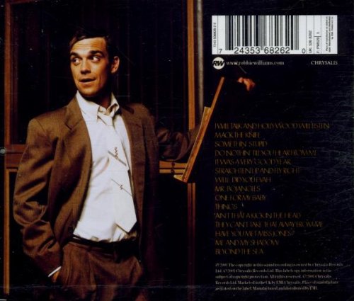
I analysed the Robbie Williams digipak because it fits the jazz genre.
Digipak analysis of conventions – Robbie Williams: Swing when you’re winning
Main image: The main images are of the male artist, Robbie Williams. This is conventional to the Jazz/Swing genre and the Pop genre he originates from as he is a young, attractive singer, therefore the main focus of attraction to appeal to his fanbase. Conventionally, he is presented with a Medium Close-up which allows the audience to see him clearly. Although he is looking away from the camera, enough of his face can be seen to appeal to audiences.
Star motifs – refer to Dyer’s theory:
Williams’s ‘Star Image’ is apparent within this digipak as he is conventionally represented to the Jazz style which he is not associated with much, therefore his ‘look’ is visually appealing. Further, the use of the medium close-up allows his face to be sold to the audience clearly. He looks smart and professional, but cheeky and relaxed at the same which reflects the genre as well as Williams himself. It is clear that a ‘star image’ is being created and his personality being sold to the audience.
Lighting and colours: The digi-pak is heavily reliant on themed colours, using mainly shades of brown and white – this is reflected in the font, scenery depicted and even the clothing of the artist. These colours suggest a rustic, smart casual setting – similar to the image reflected by Williams himself.
Sub images: The only sub images used in the digi-pak are props relating to the artist, showing him in a particular setting (music studio). They are used to show him in a natural environment and to enhance his character, giving context and a sense of habitual behaviour within the images, allowing the audience to engage with William’s personality as a selling point.
Typography/font: The text is bold and easy read, with the artist’s name as the main focus. The font of the artist’s name is a different colour, bringing it more in line with the colour scheme in the images.
Layout: The artist remains the main selling point of the digi-pak, on both the back and front his image occupies half of the page. The text is very readable and bold making the digi-pak very approachable and welcoming to a consumer.
Information: key information is visible on the digipak which is conventional to the product, and required for legal purposes. For example, album name and artist name is apparent which is needed to sell the digipak, as well as the legal information such as a barcode and institution details.
Album name and track-list: Both are laid out very clearly for the consumer to reference. The font colours correlate with the imagery.
What I would take from this:
-Main image of the star as the focus
-Star to wear a suit
-Colours such as black white and brown to be used
-Classic typography.


One digipak analysed well in terms of the conventions used and some suggestions on what ideas you will take with you for your own work.
ReplyDeleteTo improve;
-include the analysis that the other two boys did. Be more efficient in collecting and sharing the tasks